Airline Safety
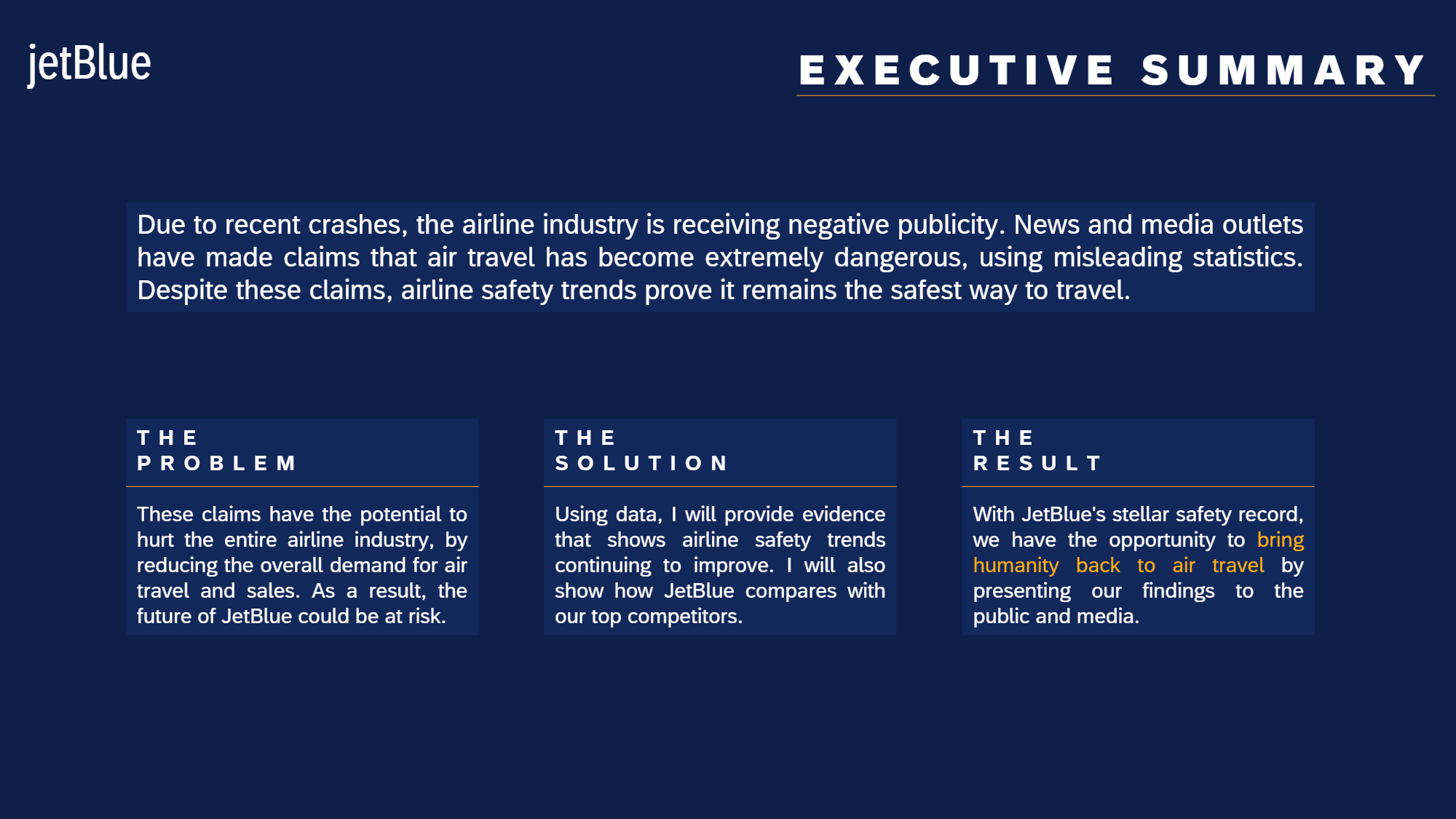
Due to recent unfortunate airline crashes, the media has been promoting statistics stating air is no longer a safe way to travel. The news and media outlets have been bombarding the public with reports and figures about the trends of airline safety and that things are not looking good. What was previously thought as the safest way to travel, especially when compared to automobiles, is now being presented as one of the most dangerous to the public. But are any of these claims based on facts?
I work for an airline on the data science team as a data analyst and a resident data visualization expert. I have been tasked with helping multiple groups in the organization combat this negative publicity and help tell the airline's side of the story. There is a fear internally about what this type of media coverage will do to airline sales and how it could impact the future of the company. Not only do they need me to help create some internal communications, but I am also tasked with what is published to the public and the media.
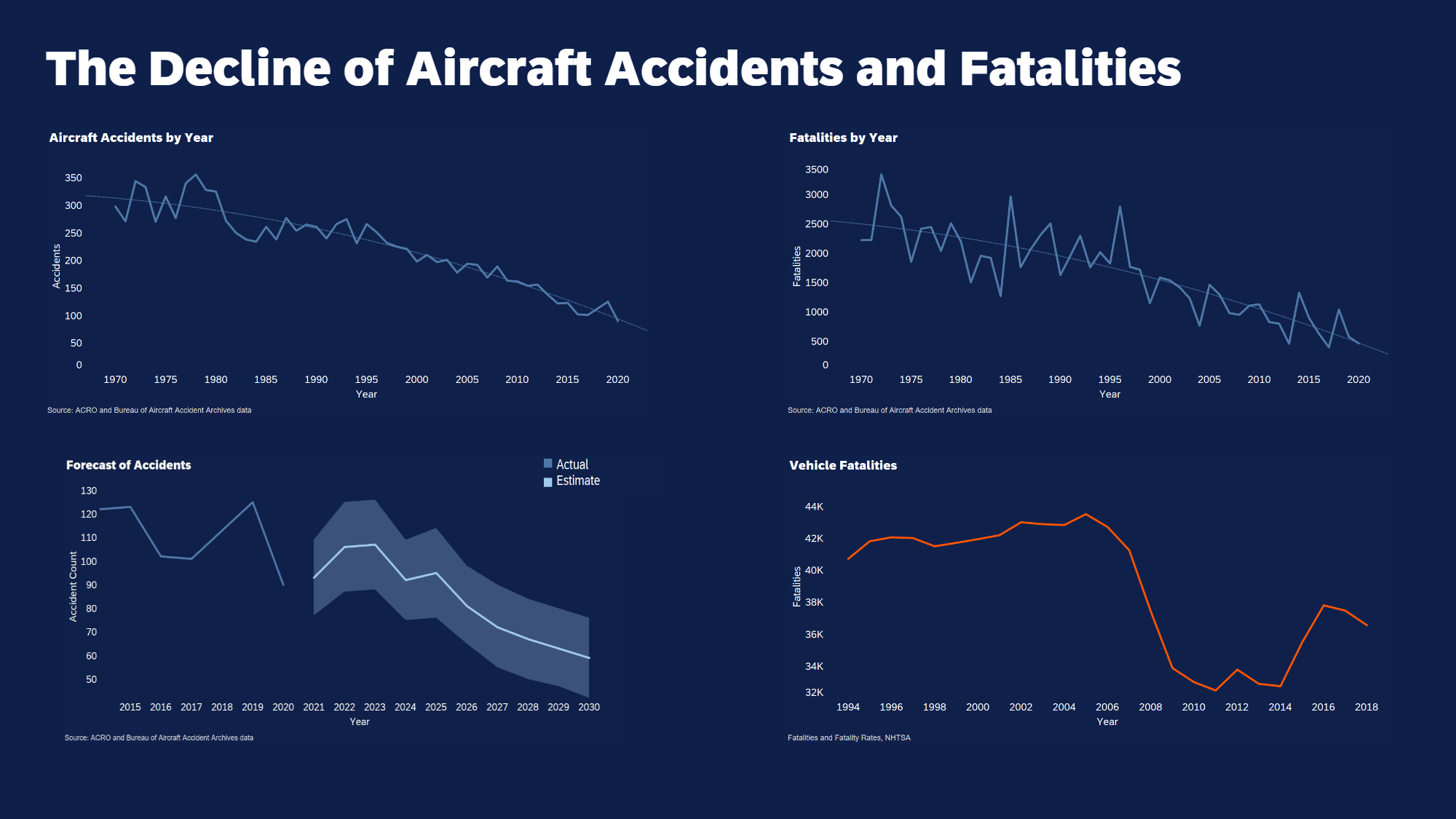
I am tasked with creating an internal dashboard for my peers and data science management team that outlines the facts – what are the stats and what are the trends? Is there any supplemental data that I can use to support that air travel is still in fact the safest?
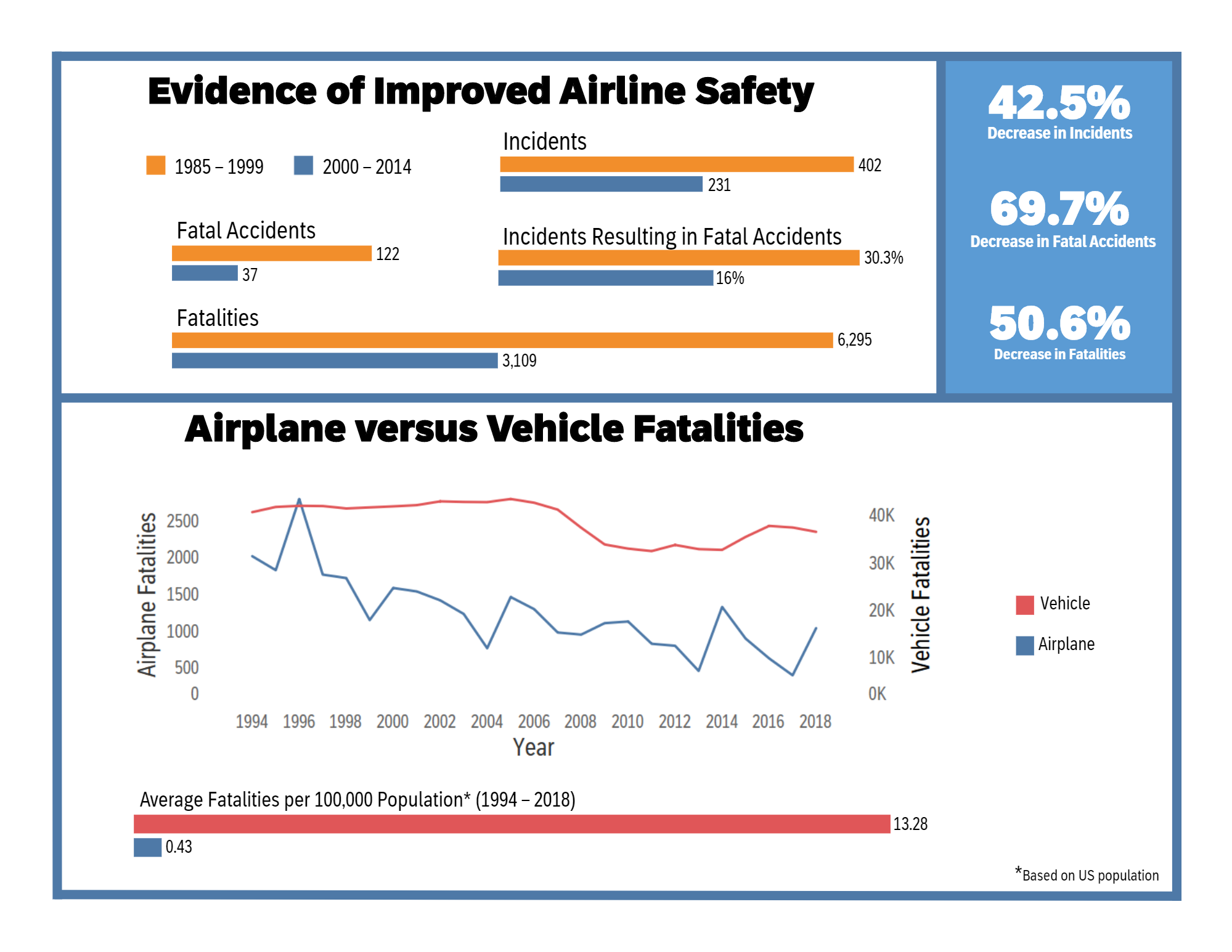
My dashboard was well received by the internal team and while some of the information was news to everyone, the entire consensus was that it is ready to be prepped for an executive review, so the external communications can be started. My next task is to prepare an executive summary summarizing my findings and telling the story of what I found.
My audience will be senior leaders that care about the portrayal of the industry and their airline specifically. They also want to make sure they are being ethical and sharing information that isn’t misleading. This presentation will set the tone for how the media is addressed going forward with the information and facts that need to be shared. Also remember that this audience regularly speaks with shareholders – so any information I can find to help predict future risks and the position of the company will be beneficial to the conversation. For example, if I found information that indicates where future sales will be impacted or where there are safety risks – this is important information to raise to this group.
Disclaimer: I approach this task as though I were working for JetBlue.
Now that I have given your presentation to my executive team, I need to create a blog post that they can use to spread through online news sources, social media, etc.
I’ve successfully gotten my blog post out, which has started to be shared with local news outlets and I have seen it shared on various platforms. While somewhat controversial in the data visualization world, I have been diligently working on an infographic that has nice clear, creative visuals that help articulate the message and inform the public what the real story is! This audience is likely standing in line and would see this infographic on a wall or is scrolling on their phone quickly – so grabbing their attention is key and making sure the visualizations makes sense is the only way I can change their opinion or inform them of what is really going on.

My final task is to help spread the word on the truth about what I have found and represent my Airline via a short 3-minute presentation that combines the 3-minute story and the Big Idea as described in Chapter 1 of Storytelling with Data. The premise of the 3-minute story is that I must find a way to convey everything I need to in that short timeframe, which I do using any of the previous media that I have created or something brand new.
Airline Safety
Disneyland Review Analysis
Credit Card Churn

Credit Card Churn
Health Insurance Cost
I would love to hear from you.